2-colour jobs: If you use duotones in a 2-colour job, the screen angle of the second color should be different from the first color. Many applications like QuarkXPress by default use the screen angle of black for spot colors but most 2-color jobs are a mixture of black and a spot color.
Spot colors: We maintain a supply of ‘standard’ Pantone colors. Using these colors in a job can be much cheaper than using a specific PMS color that has to be ordered or custom mixed.
Spot colors in a CMYK job: If you use a number of Pantone colors in a job that will be printed in CMYK, you should mark these colors for separation in the layout program. To check this, go to the ‘Print’ menu and select ‘Separations’. Then have a look at the number of plates that are shown.
4+ colors: If your jobs will be printed in more than 4 colors, it may be worth talking to us before you start. We may be able to make suggestions for your design has to adapt it to our equipment so we can easily print the additional colors.
XPress red, green and blue: Never use the Red, Green and Blue colors from QuarkXPress. These are RGB-colors that are routinely switched off by our prepress operators.
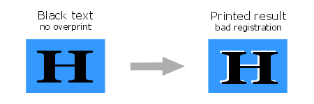
Black in overprint: In most cases, black text, lines and fills that overlap colorized backgrounds should be set to overprint. If this is forgotten, it may cause white spaces when the job is printed.
Rich black: For small black objects that are partly positioned on a light background and partly on a darker background, it is better to use a “rich black”. This is 100 percent black with 40 percent cyan and/or magenta added to it. This way the background does not shine through the black object. The top bar in the example below shows the problem.
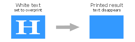
White set to knock-out: QuarkXPress has the annoying habit of forgetting to switch off ‘overprint’ settings when black text is changed to another color. This can cause the text to disappear. Make sure white text is set to ‘knock-out’.
Naming conventions: When you use spotcolors in a file, their names should only contain the standard 27 characters of the alphabet and numerals to 0 to 9. Use an underscore instead of a space if you want to separate words in the name of a color. Using brackets of any kind can lead to various PostScript problems on some RIPs.
color matching: Some colors like clear oranges, violets and greens as well as at least half of the Pantone colors that exist are difficult to match in 4-color CMYK printing. Unless carefully calibrated, monitors always show brighter, more saturated colors than can be achieved in the printing process. Also remember that your monitor may be calibrated differently than ours.