So you want create artwork in Adobe Illustrator…
First and most importantly, the default configuration for anything created in Adobe Illustrator is CMYK. For big runs, that is just fine and dandy. For a letterhead or business card order of less than several thousand pieces – you are spending more money than you should by sending CMYK artwork to the printer.Following the instructions below, we will change your file from that CMYK default mode to a file format using Pantone “spot colors” which should save us time and you money.Study the pallet to the right. See how many colors are in it. If you send a job to your printer with all these colors in it – and ask for a 2 or 3 color job – you risk causing confusion.
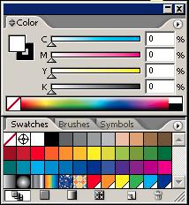
So, let’s clean up that pallet and reduce the number of colors we can see in that window. Doing so will make it easier for you to add the Pantone Matching System (PMS) colors you need to create a good looking finished product.
In your color pallet, click on the pull-out arrow, then click on “Select All Unused”.
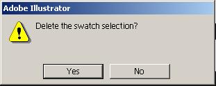
A small white line will appear around each and every color that is NOT being used in your artwork file.
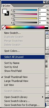
Next, click on that same pull-out and choose “Delete Swatch”.
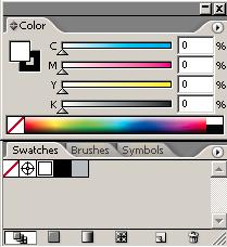
- In most files there will be a few colors left. Don’t worry about those right now. We can address that issue after we setup our pallet with one or two Pantone spot colors.
- In a new file, you will be left with only two colors: White and Black.
- If you happen to have a gray color in your color pallet, it may be possible to change it to a shade (screen tint) of black. For example, “smoke” is about a 20% screen of black ink.

Answering Yes here eliminates the extra colors…
Then, once the color pallet is down to only black, white and a shade of black, we need to add the Pantone Colors that you want to print.
Here’s how to add Pantone Spot Colors:
- Click on the “Window” pulldown.
- Click (near the bottom) on “Swatch Libraries”, then “Pantone Solid” – coated or uncoated (doesn’t matter to me – both look the same on screen)
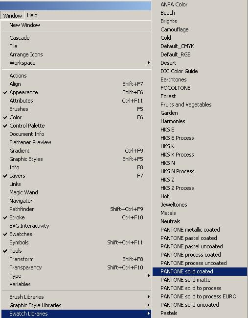
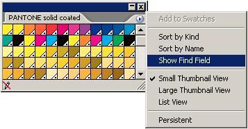
A new window with lots of colors in it appears that says “Pantone Solid Coated at the top…

Unless you have lots of time to scroll through the list of colors, the easy way to add a particular color is to click on the pull-out in the “Pantone” window and click on the “Show Find Field”.
Then, simply type in the color number you want (like 185 is a bright red) – That color will be highlighted with the little white line again…Click on the pull-out again, then click “Add to Swatches” – The new color will appear in the normal color pallet in illustrator.
Repeat the process for additional colors – and we have a job that will print using Pantone Spot Colors…
Food for thought: Black is a color too, so Black and two PMS Colors will make a three color card. White doesn’t count as a color because the artist can reverse out of any color with White – IF we print on white paper…
It sounds like a lot of steps, but it shouldn’t take but a few minutes to make these changes. The time you spend is time our pre-press department doesn’t have to spend – and time saved by us is money saved by you! To test your file print color separations on your laser printer. If you have PMS185 (red), PMS286 (blue) and Black in your artwork – printing color separations should result in three pieces of paper from your printer. If that isn’t what you get, you may need additional help or try the instructions here one more time.
There is only one other thing that needs to be addressed here: Most artists create bleeds that don’t really bleed… What I mean is, that solid or screen that runs to the edge of the paper on your artwork needs to extend just a little beyond the edge of the paper margin. That way when our Bindery Department gets started cutting your job it doesn’t end up with a little bit of white space on the edge of the page.
We know you don’t want that white space at the edges, but if you don’t give us something to work with – we have to build it for you. If we build it, it takes time, and if you managed to read this far you know what that means…
DISCLAIMER: Consolidated Press does not hold any interest in or alliance to the Adobe Corporation, Pantone Inc, or Microsoft Corporation, any of their subsidiaries or employees. Adobe Illustrator, the Illustrator program and any references on this site to Adobe, the Pantone Color Matching System (also referred to as PMS Color) or Microsoft Windows are purely for informational purposes. Those products are registered trademarks and/or copyrighted and patented products fully and completely owned by their respective companies and not Consolidated Press.